Explore the project David Eimer
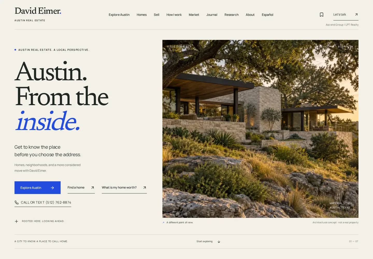
Start with the city. Then find the home.
An editorial identity and interactive field guide for a more considered move.
Design preview. Architectural imagery is concept art, not a property listing.
Art direction. Digital design. A reason to care.
Websites that make people feel something.
And know exactly what to do next.
Different people.
Different possibilities.
Explore the project Start with the city. Then find the home.
An editorial identity and interactive field guide for a more considered move.
Design preview. Architectural imagery is concept art, not a property listing.

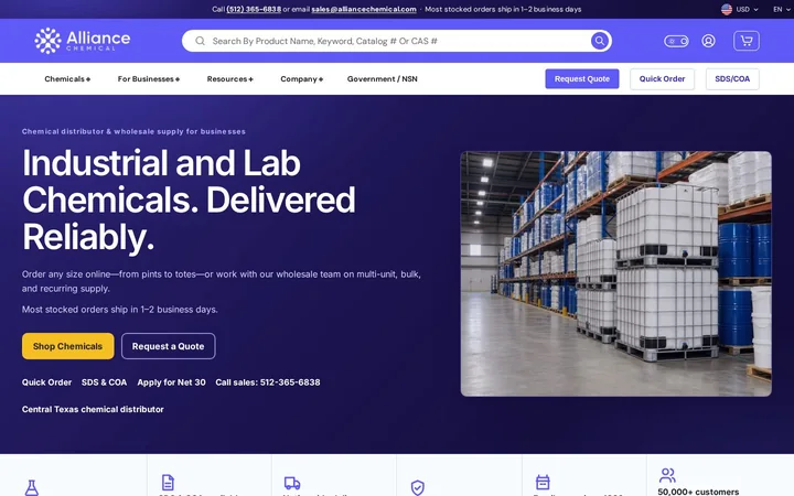
A storefront backed by search-led content.
Commerce, a technical library, blog and SEO work, and ongoing Instagram management.

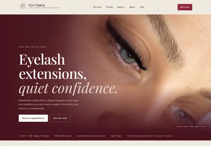
Real client work, close enough to inspect.
Art direction, interactive detail, local SEO and a clear path to booking.
Three original directions, made here.
Not client commissions. An open sketchbook of what a website could become.
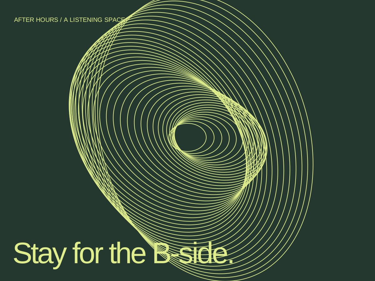
A listening space, built around the ritual of a record. Slow movement makes room for attention. The programme gives it somewhere to go.
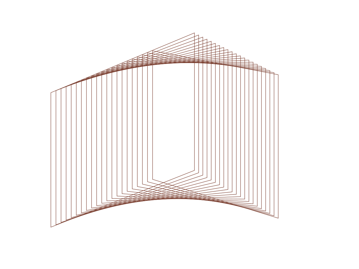
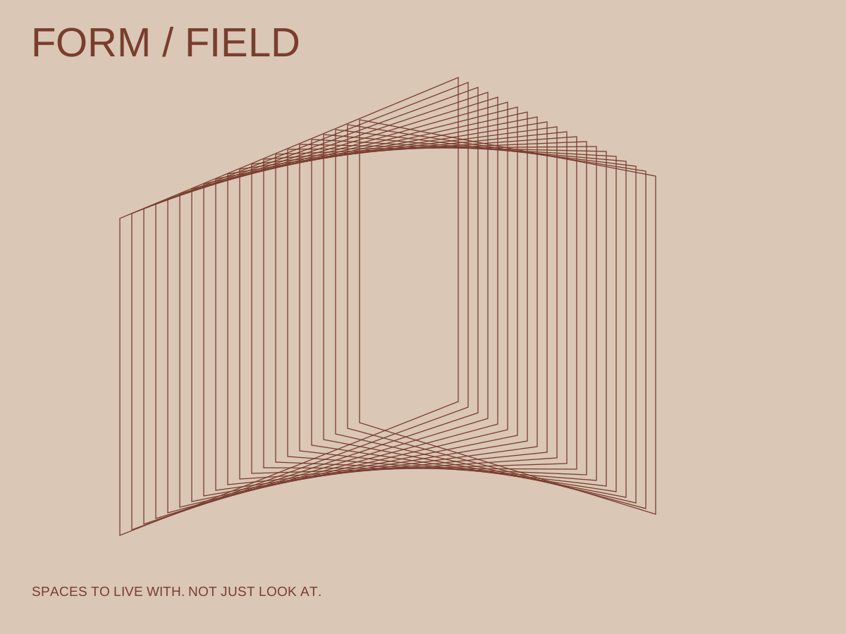
Culture / Identity / MotionAn architecture direction that moves between atmosphere and information. Explore the volume, then read the plan. A beautiful space should also make sense.
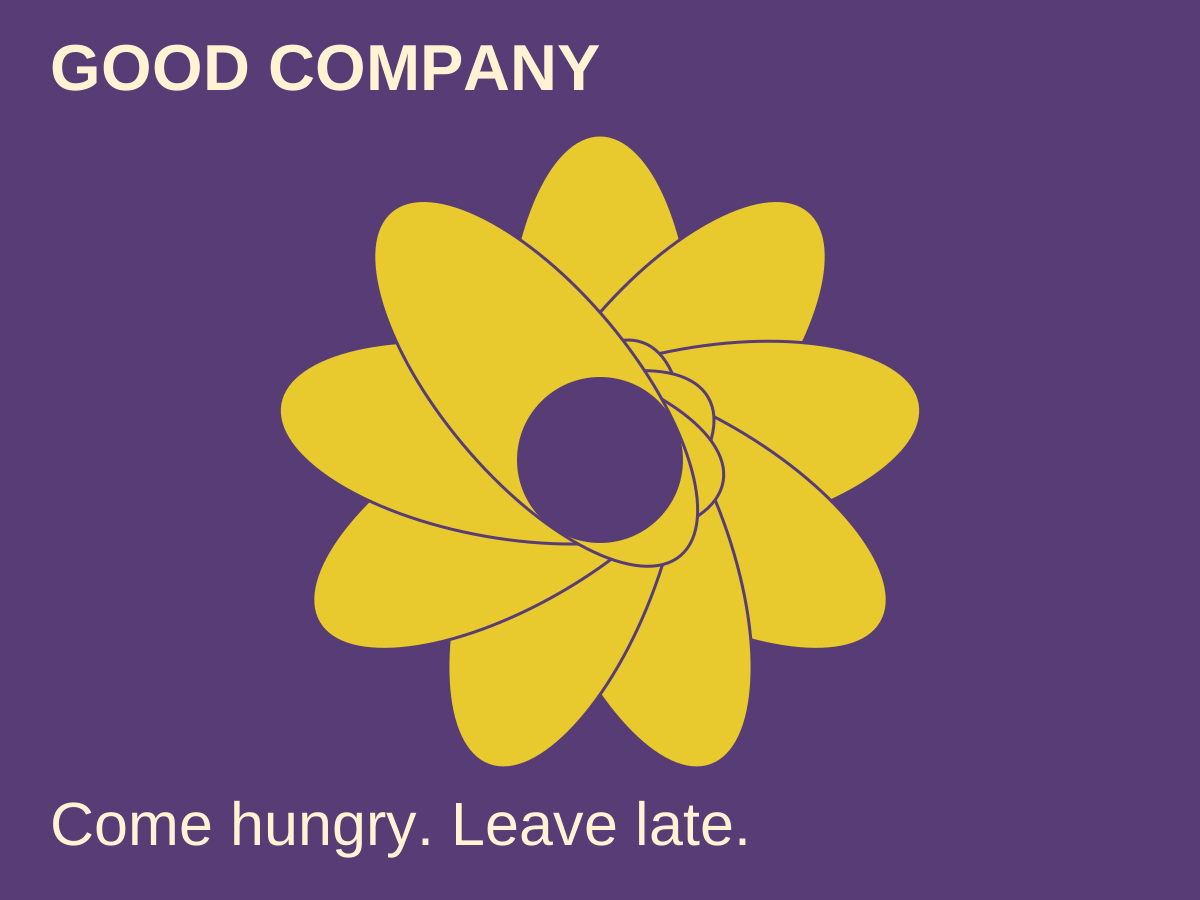
Architecture / Editorial / InteractionThe invitation matters. So does finding the menu without a treasure hunt.
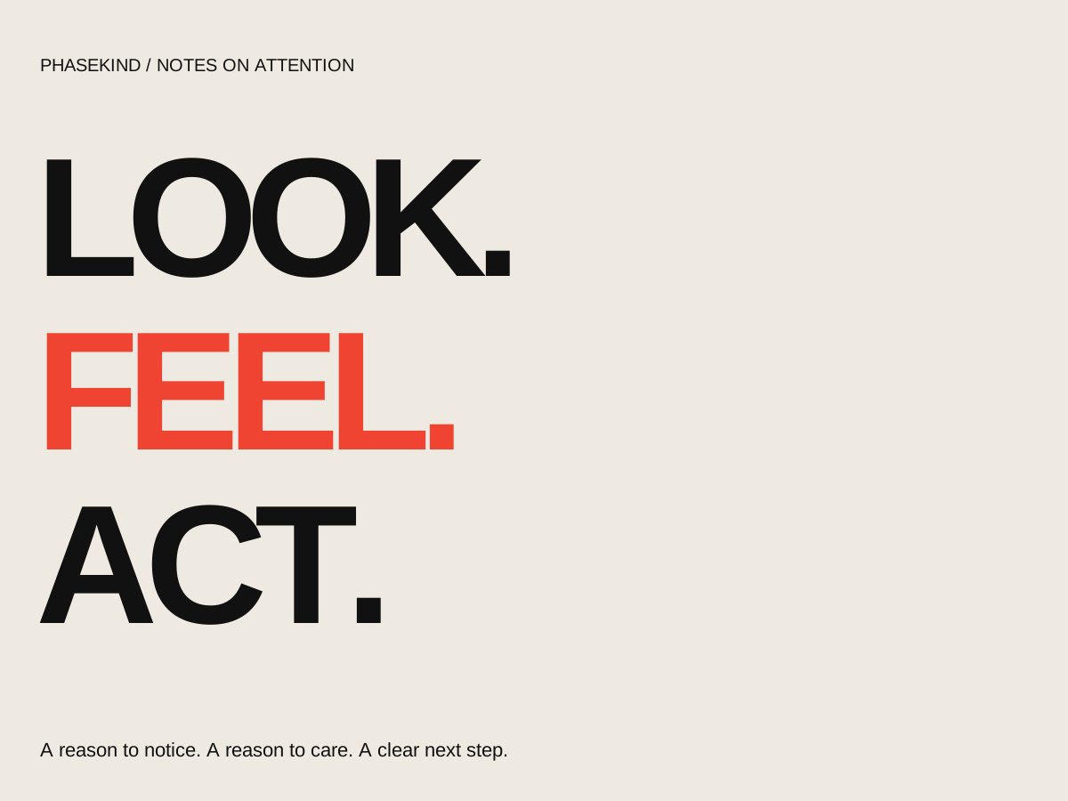
Give people a reason to care. Help them find you. Make the next step easy.
Design and development, paid ads, organic content, SEO/GEO and AI automations—with the same attention to how it all works together.
A memorable website earns a second look. A thoughtful one makes that look count.
Who needs to find you? What do they need to believe? What should happen next? These questions belong in the design, not in a separate strategy deck.
Recognition. Then a reason to act.
The identity, the words, the journey and the build should make the same argument. That is what we make.
Small things we made to see what would happen. Everything here is real and running.
A word can change its shape without changing its mind.
Get a little closer. There is always more in the details.
Same ingredients. Another way of seeing them.
One voice, two compositions. Move between the directions.
A few things from the studio, passing through.
How little can a website be? This little.
We don't start from a template or a trend. We find what is visually and culturally distinctive about the person, the work or the idea, decide what visitors should feel, and what they need to get done. The type, the interaction, the structure and the stack follow from that.
At the work, the room, the customers, the competitors, the old site. Slowly, before anyone opens a design tool.
The one quality that is true of this business and not of the others. A listening space needs a different rhythm from an architecture practice.
Type, color, motion, structure and copy chosen for that thing, so the site could not be swapped with anyone else's.
Booking, checkout, documents, freight, search. The parts a visitor came to do, built properly and measured after launch.
Then we take things away until only the argument is left.
Phasekind · type specimen · Bricolage Grotesque + Archivo
Aa
Websites with fingerprints.
Body 17/1.55. We design and build websites for people who care what things feel like.
Tiny 11/1.4 · used for annotations, figures, statuses
brand, visual direction, client experience
design engineering, systems
PHASEKIND is an independent digital studio in Austin.
Two people, small by design. We bring in specialists for photography, 3D, identity and illustration when a project needs them. Every project stays close to the people designing and building it.
More about the studioA new idea. A new chapter. Something hard to describe. Start there.